{challenge} The primary design challenge was to create a useful and engaging tool that would effectively encourage employees to consistently log their work hours. The previous internal system was characterized by a lack of intuitiveness and operational complexity, which negatively impacted its adoption and effectivenes.
The inadequacy of the former solution highlighted the need for a visual identity that was not only aesthetically pleasing but, more importantly, functional and user-friendly, capable of positively influencing habits in the time logging process.
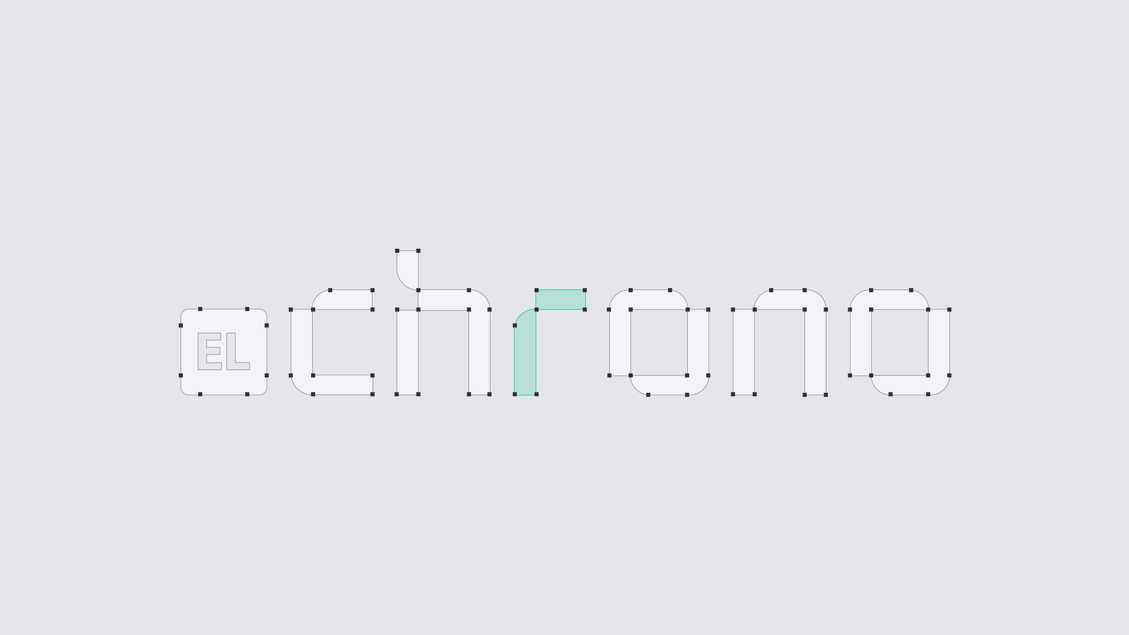
Branding strategy for EL Chrono focused on establishing a modern, accessible, and effective visual language that reflected the core value proposition of the product: affordable and seamless time tracking. The objective was to design a brand that would not only be visually appealing but also inspire confidence and motivate users to choose EL Chrono as their preferred time management solution.


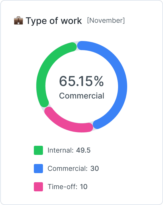

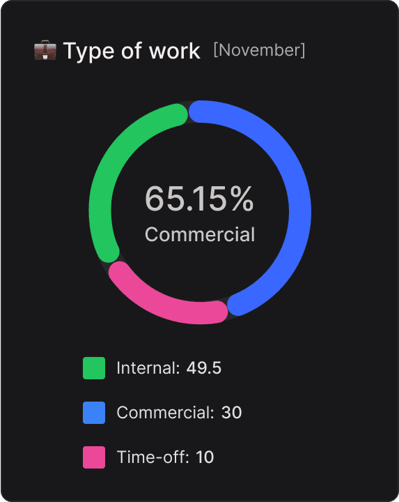
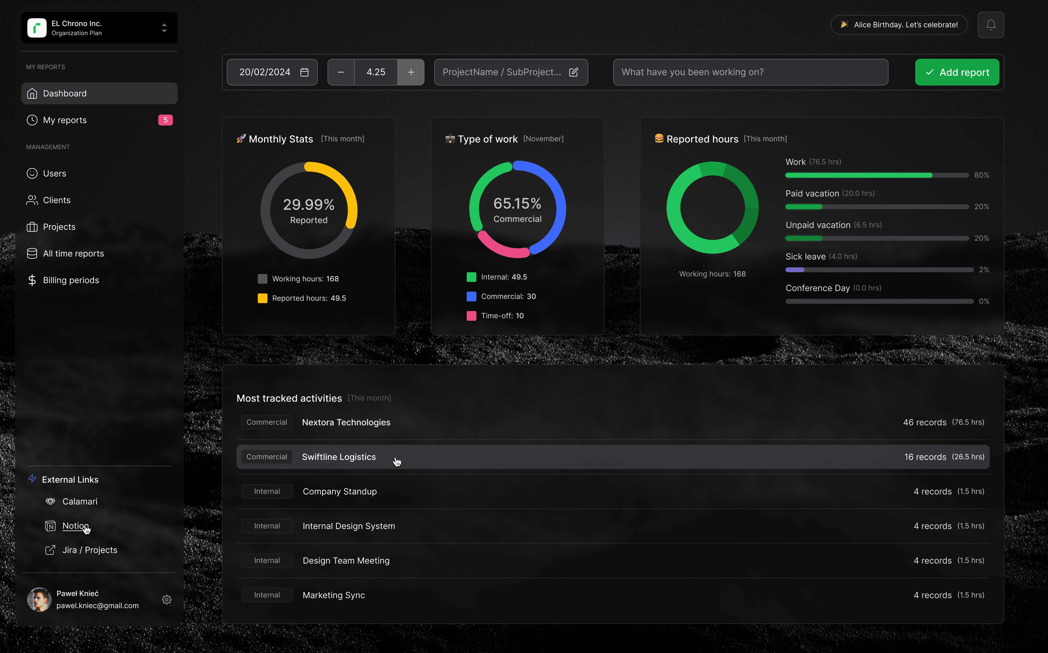
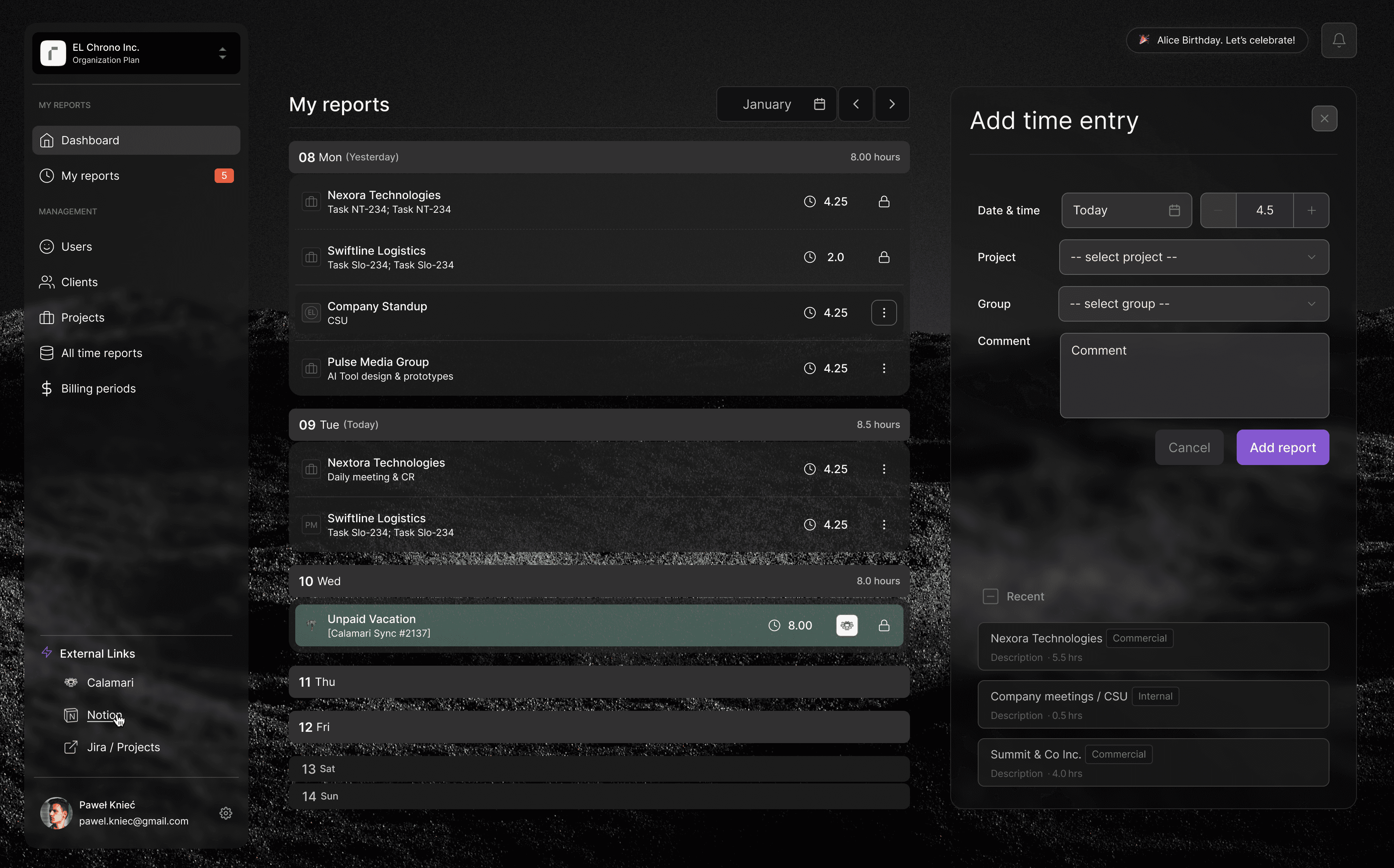
The branding of EL Chrono directly influenced the design of key user interface elements. The consistent application of the color palette, typography, and iconography style ensured a unified and professional appearance throughout the application. Buttons, forms, and other interactive elements were designed with intuitiveness and ease of use in mind, directly addressing the challenge of the previous system's unfriendly interface.
The consistent use of branding elements throughout the product contributed to creating a cohesive and professional user experience.
The previous internal system was characterized by a lack of intuitiveness and operational complexity, which negatively impacted its adoption and effectiveness.
The inadequacy of the former solution highlighted the need for a visual identity that was more functional and user-friendly, capable of positively influencing habits and increasing engagement in the time logging process.
